
If you’ve ever stood in a paint aisle wondering whether gray walls will clash with your beige carpet, you’re not alone. This mix of warm and cool tones is one of the most common design dilemmas for homeowners and renters alike. Gray feels calm and modern, while beige gives a room warmth and comfort. When combined without thought, though, they can easily feel mismatched or dull.
The truth? Gray and beige can absolutely work together — beautifully, in fact — if you know how to balance them. It all comes down to picking the right undertones and using connecting details like trim, lighting, and furniture to tie the look together. This guide will show you how to make the two neutrals complement each other instead of compete.
Understanding the Core Conflict: Warm vs. Cool
Before you start painting or rearranging, it helps to understand why gray and beige don’t always get along.
- Beige is a warm neutral with undertones of yellow, red, or orange. It gives off a cozy, inviting vibe.
- Gray is a cool neutral, often leaning toward blue, green, or purple undertones. It feels sleek, crisp, and contemporary.
The problem happens when those undertones clash — like pairing a blue-gray wall with a yellow-beige carpet. The room can feel off-balance or even cold. But once you match the undertones or find a middle ground, the two colors can create a layered, sophisticated backdrop that works with nearly any decor style.
The Secret Weapon: Choosing the Right Gray
The easiest way to make gray walls and beige carpet work together is by picking a gray with the right undertone. Think of it as matchmaking for colors — you’re not just pairing any gray with any beige, you’re finding two that get along naturally.
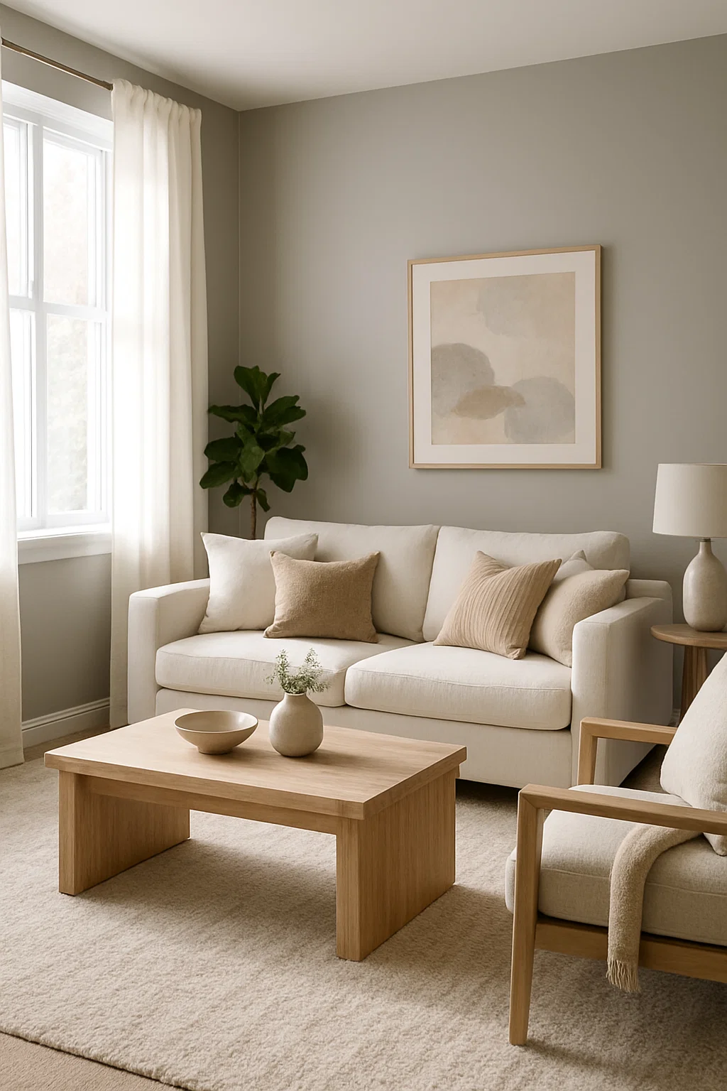
1. Embrace “Greige” — The Perfect Middle Ground
If you’re unsure where to start, go for greige, a blend of gray and beige. It’s warm enough to complement beige carpet yet still brings the modern edge of gray. Shades like warm taupe, mushroom gray, or light stone are ideal because they share similar brown or beige undertones. In natural light, these hues feel soft and balanced, making the entire room look cohesive.
2. Go Cool for Contrast
If you prefer a bit of contrast, choose a cool gray like slate or charcoal. These work best when the room gets plenty of sunlight, as the light helps prevent the space from feeling cold or heavy. The key is to make the contrast look intentional. When done right, cool gray walls can make beige carpet look richer and more defined.
3. Avoid Stark, Pure Grays
Pure, cold grays—those that resemble concrete—can clash with beige’s warmth. They often make the carpet appear yellowish or outdated. Unless you’re going for a stark industrial look, it’s better to skip these harsh tones.
The Bridge: Connecting Walls and Carpet
Once you’ve chosen your gray shade, the next step is making sure your walls and carpet don’t just coexist — they flow. The best way to achieve that is through the “bridge” elements in your room: trim, furniture, and décor. These pieces create harmony between the coolness of gray and the warmth of beige.
1. Trim and Doors — The Clean Break
Think of trim as the line that keeps everything balanced. A crisp white or soft off-white trim can act as a clean divider between gray walls and beige carpet. If your beige carpet has flecks of lighter tones, try matching your trim to that shade — it subtly ties the two surfaces together.
2. Furniture and Wood Tones
Mid-tone woods like oak or walnut are your best friends here. They naturally contain both warm (golden) and cool (grayish) undertones, helping bridge the gap between your wall and floor colors. For a cozy finish, mix in materials like leather, linen, or rattan in neutral tones such as cream, taupe, or soft brown. These textures add depth while keeping the palette calm and cohesive.
3. Area Rugs — The Blending Layer
An area rug that includes hints of both gray and beige is a simple but powerful fix. It serves as a visual anchor, drawing the two colors together. Look for patterns with soft gradients, abstract designs, or subtle geometric prints — they break up the color difference naturally while adding interest underfoot.
Accents and Accessories: Adding Pop and Polish
Now that your gray walls and beige carpet are balanced, it’s time to bring the space to life. The right accents and accessories can make your neutral palette feel intentional and full of personality — not flat or dull.
1. Accent Colors That Work
You can go in two directions here — warm or cool — depending on the mood you want.
- Warm Accents: Think mustard yellow, copper, burnt orange, or terracotta. These highlight the warmth in your beige carpet and create a cozy, welcoming atmosphere.
- Cool Accents: Deep navy, sage green, or emerald tones pair beautifully with gray walls. They keep the space calm and elegant while adding visual depth.
If you’re unsure, try mixing both — a navy throw pillow next to a copper vase can look surprisingly sophisticated.
2. Metal Finishes for Balance
Don’t be afraid to mix metals. Combining brushed brass with matte black creates a balanced, modern look that complements both gray and beige. Black grounds the room, while brass adds warmth and shine.
3. Texture Makes the Magic
Since your main colors are neutral, texture is what keeps the design interesting. Add layers with chunky knit throws, linen cushions, and velvet chairs. This variety prevents the room from feeling too flat or monotone.
Conclusion: Confidence in Neutrals
Gray walls and beige carpet might seem tricky at first, but when you understand how undertones work, they become one of the most versatile combinations in home design. The key is to find harmony — not perfection. A warm, greige-toned gray paired with connecting details like white trim, mid-tone wood furniture, and a blended area rug can completely transform your space from mismatched to magazine-worthy.
Don’t be afraid to experiment. Bring home paint samples in different lighting, test fabric swatches, and notice how your room feels at different times of the day. Once the tones align, you’ll see how calm, balanced, and timeless the mix can look.
What to do next: Start with a few “greige” paint chips and hold them against your carpet in daylight. You’ll quickly spot which ones bring everything together — and from there, you can build your dream neutral space with confidence.