
Gray is one of the most versatile colours in interior design. It can be soft and cosy, sharp and modern, or completely neutral depending on how it’s used. But here’s the catch — not all grays are the same. The subtle difference between warm gray and cool gray is what determines whether your space feels inviting or sterile, harmonious or mismatched.
If you’ve ever painted a wall only to discover it looks green in daylight or purple in the evening, you’ve already experienced the power of undertones. This guide will help you spot the difference between warm and cool gray, understand why it matters, and choose the right one for your home.
Understanding Gray Undertones
Gray may seem neutral, but every gray carries undertones. A “cool gray” often leans towards blue, green, or purple, while a “warm gray” picks up red, yellow, or beige notes. These undertones reveal themselves when the colour is compared against white trim, wood tones, or even fabrics.
Designers often use terms like greige (a mix of gray and beige) or taupe (a gray-brown with warmth) to describe popular shades that bridge the two families. A true “neutral gray” is rare because almost every formula picks up subtle hints that shift with lighting and context. If you’re also deciding on flooring, here’s a helpful guide on what carpet color goes with gray walls.
Professional decorators rely on tools such as fan decks, peel-and-stick paint samples, and even colourimeters to evaluate undertones before committing to a full room.
How Light and Orientation Affect Gray
Lighting is the single biggest factor in how gray reads in a room. The same paint colour can look completely different depending on your light source and room orientation.
- Natural light: North-facing rooms often make cool grays feel icier, while south-facing rooms amplify warmth. East-facing spaces glow warmly in the morning but look cooler by afternoon.
- Artificial light: Incandescent bulbs add yellow, softening cool grays; LED daylight bulbs (4000–5000K) push grays towards blue. The Correlated Color Temperature (CCT) and Color Rendering Index (CRI) of your bulbs matter as much as the paint.
Benjamin Moore Gray Owl can appear like a fresh, balanced gray in a south-facing dining room, yet shift greenish in a north-light bedroom.
This is why interior designers recommend checking Light Reflectance Value (LRV) on swatches and observing samples in morning, midday, and evening light before deciding.
Warm Gray: When and Why to Use It
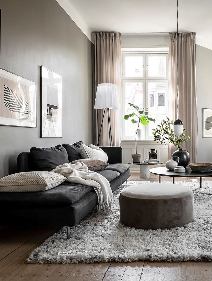
Warm gray works best in spaces where comfort and cosiness matter. Think bedrooms, living rooms, or dining spaces that need a welcoming backdrop.
- Materials: Warm gray pairs beautifully with natural materials like oak, walnut, or maple flooring, beige upholstery, or linen curtains.
- Hardware & accents: Warm metallics such as brass, bronze, or copper enhance its richness.
- Textiles: Jute rugs, wool throws, or bouclé chairs bring out the earthy undertones.
- Paint picks: Sherwin-Williams Agreeable Gray, Benjamin Moore Edgecomb Gray, and Dulux Warm Pewter.
In traditional or farmhouse-inspired interiors, warm grays add just enough softness without pulling the room into yellow or brown territory.
Cool Gray: When and Why to Use It
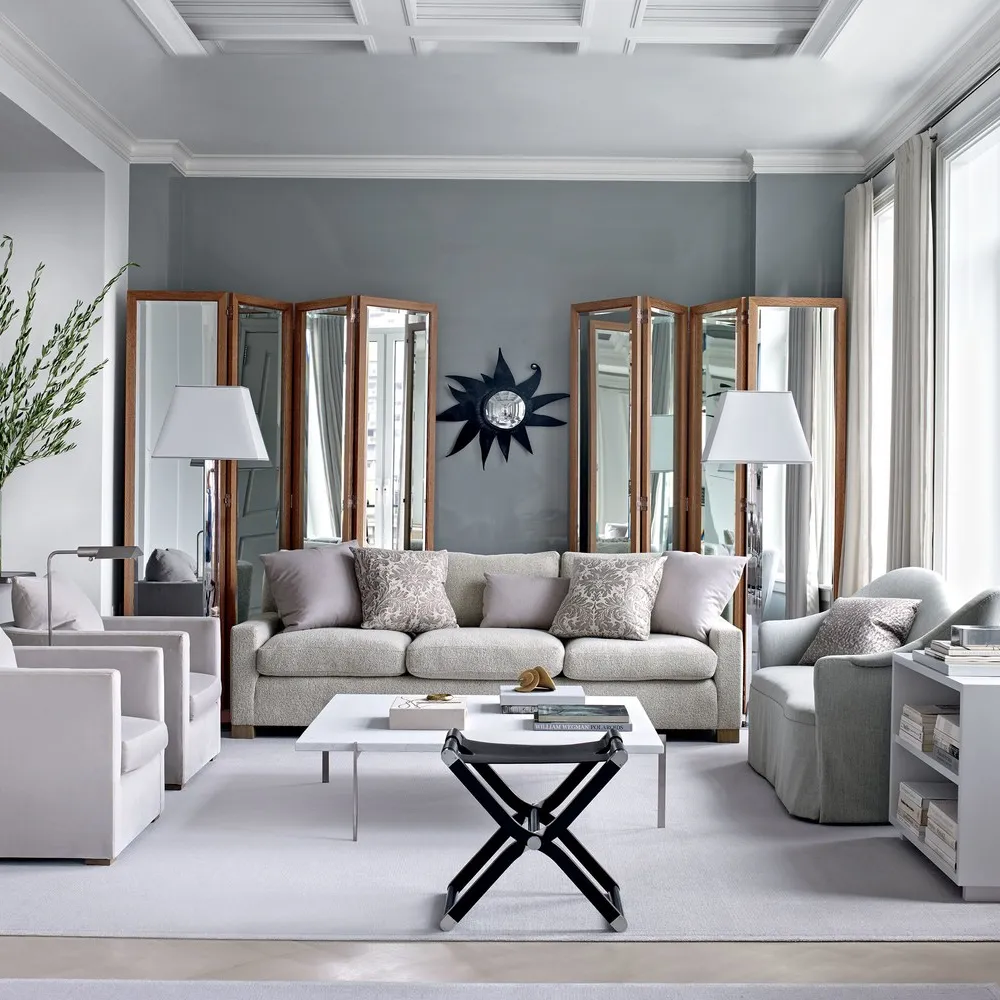
Cool grays excel in modern, minimalist, and urban spaces. They bring a crisp, clean look that works especially well in bathrooms, kitchens, and offices.
- Materials: Cool gray complements polished concrete floors, Carrara marble countertops, or black cabinetry.
- Hardware & accents: Cool metals like brushed nickel, chrome, and matte black elevate the modern edge.
- Textiles: Sleek fabrics such as velvet, boucle, or leather keep the aesthetic sharp.
- Paint picks: Sherwin-Williams Passive, Benjamin Moore Stonington Gray, and Farrow & Ball Cornforth White.
Interior designers often use cool gray for Scandinavian, Japandi, or Industrial styles where clean lines and simplicity dominate.
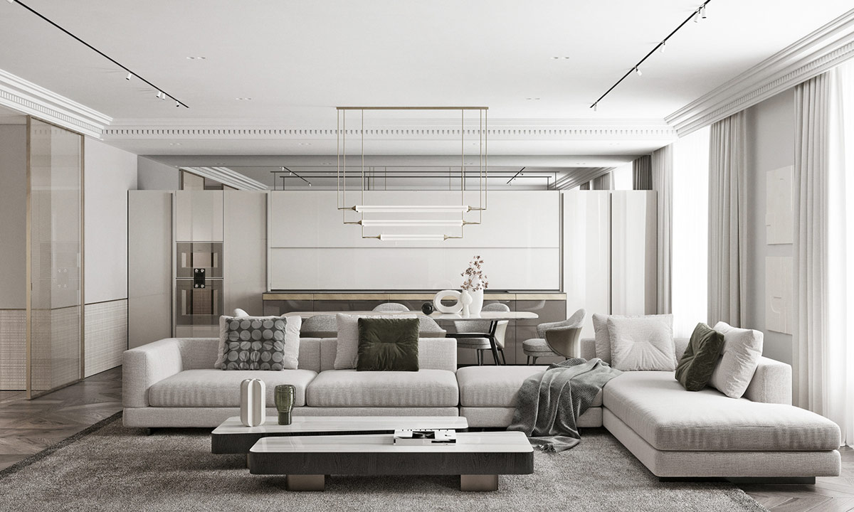
Pairing Gray with Other Colours
Gray is only as good as the colours you pair it with. Warm grays feel harmonious with earthy and muted shades, while cool grays thrive alongside crisp or bold contrasts.
- Best with warm gray: terracotta, sage green, mustard, camel, blush.
- Best with cool gray: navy, teal, turquoise, cobalt, crisp white, black.
- Trim and ceiling whites: Benjamin Moore White Dove, Chantilly Lace, Sherwin-Williams Alabaster.
Layering textures also matters. A warm gray wall against oak flooring and a sisal rug feels inviting. A cool gray wall behind a black leather sofa and chrome lamp feels sharp and contemporary.
How to Test Before You Commit
No matter how confident you feel, never skip testing. Colours shift dramatically depending on lighting, flooring, and even furniture finishes.
- Get sample pots or peel-and-stick swatches.
- Paint on primed boards, not directly on your wall — existing wall colour can skew results.
- Check at different times of day: morning, afternoon, and evening.
- Compare against flooring and fabrics. Warm oak can make a cool gray look purple, while walnut flooring balances it out.
- Tools for precision: colourimeters, spectrophotometers, and light meters give exact readings of undertones and reflectance.
Common pitfalls include colour cast (when the light shifts undertones), shadow lines in corners, and metamerism (when colours look different under different lights).
Gray Across Interior Styles
Gray adapts across multiple design movements, but whether warm or cool works best depends on the style.
- Scandinavian: cool gray with whitewashed oak and black accents.
- Japandi: warm gray with natural stone, oak, and linen.
- Farmhouse/Coastal: warm gray paired with white trim and shiplap.
- Industrial: cool gray with exposed concrete and black steel.
- Mid-century modern: warm gray softened with walnut furniture.
- Transitional: greige tones bridging cool and warm elements.
The trick is to balance undertones with the style’s core palette and textures.
Case Study: The Open-Plan Living Space
A London couple painted their open-plan kitchen and lounge in Farrow & Ball Cornforth White (a cool gray). Against their walnut dining table and brass pendant lighting, the cool gray clashed, creating a cold, unwelcoming feel.
When they switched to Benjamin Moore Edgecomb Gray (a warm gray), the space immediately softened. The undertones balanced with the warm wood and brass, while still keeping a neutral, contemporary look.
This highlights how choosing the wrong undertone can throw off a whole room — especially in open layouts where different materials interact.
Expert Insights
“People assume gray is neutral, but it’s one of the trickiest colours to get right. Always test in the actual space, because undertones can shift with the time of day,” notes Patrick O’Donnell, Colour Consultant at Farrow & Ball (source: Homes & Gardens).
Interior designer Joanna Gaines has also emphasised the importance of undertones, often favouring greiges in her farmhouse projects because “they warm up a space without feeling beige” (source: HGTV).
According to a Sherwin-Williams trend report, 62% of homeowners who chose warm grays in living areas rated their spaces as “more comfortable” compared to only 38% for cool grays. That stat shows how colour directly affects perception of comfort.
Why the Difference Matters
Getting undertones wrong isn’t just a style issue; it can impact mood, comfort, and even resale.
- Resale value: Estate agents note that buyers are more drawn to homes painted in balanced warm grays because they feel welcoming and versatile.
- Mood: Cool grays can energise, but too much makes a room feel cold. Warm grays comfort, but too much can look dated.
- Maintenance: Cool grays show dirt less on walls, while warm grays disguise scuffs better against wood flooring.
In short: warm gray adds cosiness, cool gray adds crispness. The wrong choice can tip your space in the opposite direction.
What to Do Next
If you’re deciding between warm and cool gray, follow these steps:
- Identify your room’s natural light orientation.
- List your dominant materials: oak floors, marble counters, brass handles.
- Shortlist three paints — one warm, one cool, and one greige.
- Test them on boards in different spots.
- Check with trim, rugs, and furniture before finalising.
Taking time here prevents costly repainting and ensures your gray looks intentional, not accidental.
Conclusion
Warm vs. cool gray isn’t a subtle design quibble — it’s the backbone of how your room feels. The undertones determine whether your decor reads as cosy or crisp, inviting or icy.
By understanding undertones, testing with real lighting, and pairing with the right materials, you can make gray your most powerful design tool. Whether you lean towards Sherwin-Williams Agreeable Gray for softness or Farrow & Ball Cornforth White for sharpness, always sample first and let your space guide the choice.
The beauty of gray lies in its flexibility. Master warm vs. cool, and you’ll never see gray as “just a neutral” again.